ROLE
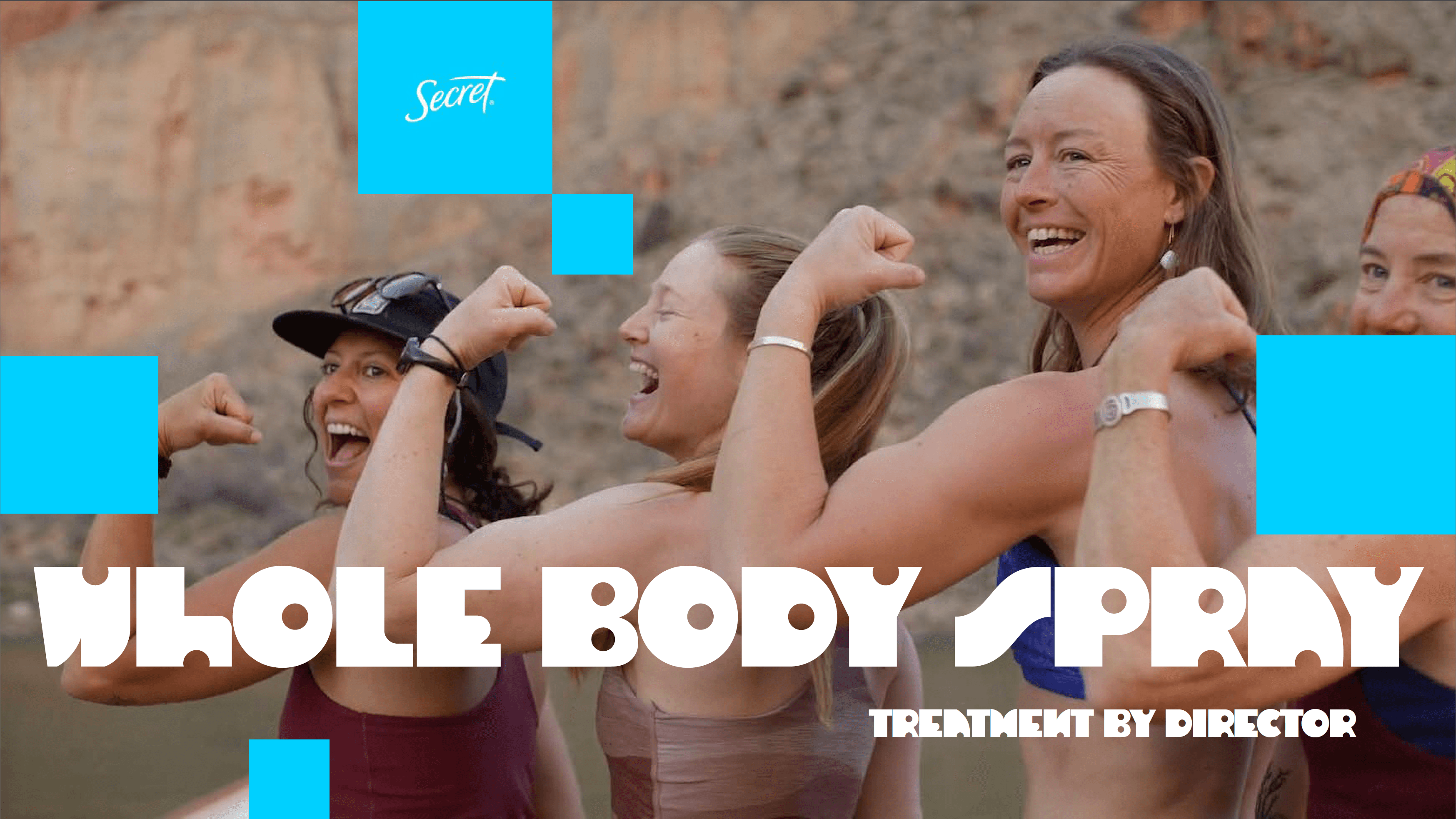
A treatment is the document that a director shows a prospective agency or client in order to “sell” their vision. As a designer, there are a few key steps to building a treatment:
Visual research, in the form of snapping film stills, editing gifs and locating other material around the web.
Putting together the imagery in a captivating format that reflects the copy and director’s personal style.
Viewing and understanding of creative vision from client (in this case, Secret Deodorant)
Approval of all images and GIFs by the director and EP for use in the treatment (I use PicDrop for this)
Publishing a document online, using InDesign (at this point, I am an InDesign wizard.)
Editing images and videos using AI tools to match brand copy/identity
These projects require a quick turnaround time! I only ever get two to three days to work on these, and the documents themselves are typically around 35-50 pages. So a lot of imagery is required, and constant communication between me and the director/EP is a must.
This treatment was for an ad campaign with Secret Deodorant. Our goal with this treatment was to celebrate all kinds of women, with lots of snappy yet aesthetic camerawork. As usual in my work, I’ve incorporated lots of moving elements and texture.
Another strange note I had to deal with during this round of creative was find pictures and moving elements with armpits, that also looked artsy and palatable for the client.
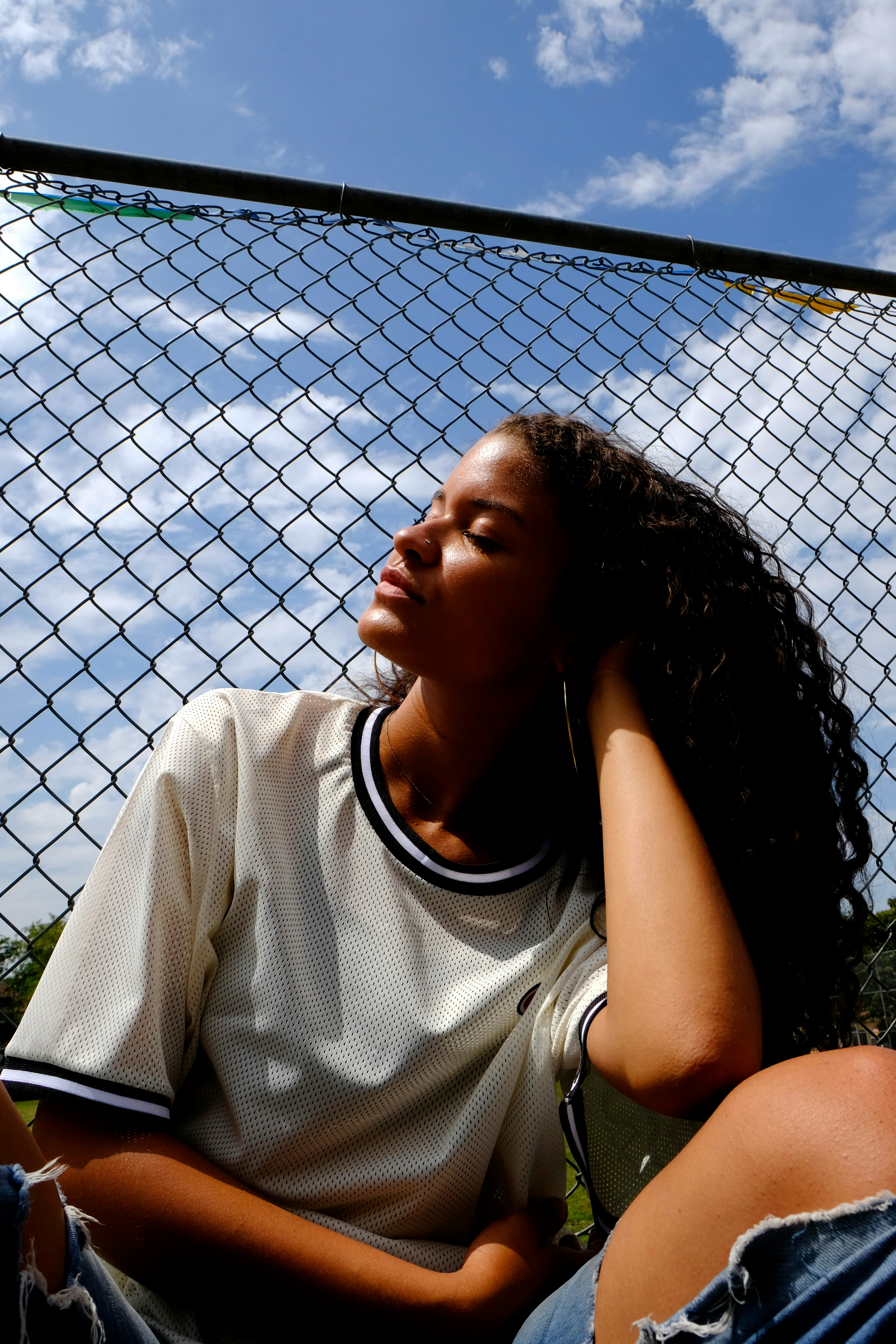


Treatments contain sensitive IP from directors and their clients, so I am only able to show you my work after I have latinzed the body copy. They're also typically very long documents, so I have curated the most defining pages in terms of look and feel for you.
Objectives of this treatment:
Celebrate a range of women. Different ages, body types, energy; through camerawork that felt snappy and editorial rather than typical deodorant-ad polish
Build out a visual world with movement and texture throughout, since the product itself (a spray) lives in motion
Solve a specific creative problem: sourcing product-in-use imagery (application, armpits, movement) that read as artsy and editorial rather than clinical or awkward. A needle most beauty/personal care treatments have to thread carefully
Show the product living "in situ" within real, lived-in environments (desert hikes, hillside walks, everyday movement) rather than studio isolation
Outcome of this treatment:
Secret picked this one. It aired in Canada. Still one of my favourite projects to see pop up.
Would you liKe another?

NEXT UP: